5 Ways to Make Your Design More Accessible in 2025
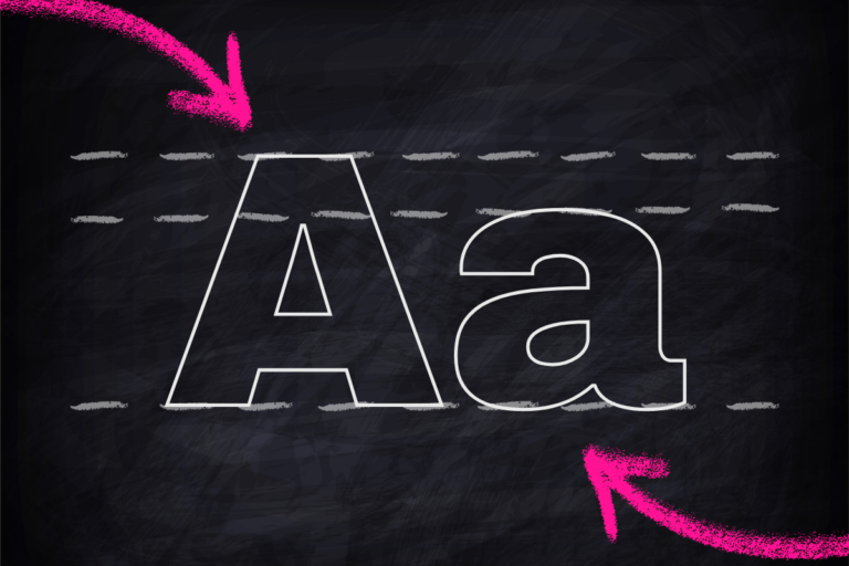
Good design is about more than aesthetics — it’s also about visual accessibility. Our design team has compiled a list of disability-inclusive guidelines to make your designs more accessible to those with visual disabilities and impairments, including why you should be using sans serif fonts over serif, the importance of the 7:1 contrast ratio, why giant blocks of text are BAD, and more. 1. The 7:1 Contrast Ratio Keeping a 7:1 foreground to background (or vice versa) contrast ratio makes reading accessible for folks with visual disabilities. Double-check your work with online contrast checkers. According to the Web Content Accessibility Guidelines at webaim.org 2. Use Sans Serifs When Possible For people with good vision, serifs are slightly easier to